The introduction of a new vertical way of growing tomatoes in Croatia, investing in local agriculture and employment, nutritious and healthy food, and setting Croatia as a competitive food exporter, as it once was, were the main parts of the brief set before my team and me. The task was not easy, but it was interesting and filled with inexhaustible sources of possibilities.
One of the founders of the CROP Croatia project is Jan De Jong, a Dutchman who played a significant role in shaping the visual identity and branding of the project.
In collaboration with his friend and entrepreneur Jerko Trogrlić, Jan decided to combine Dutch greenhouse technology with a strong Croatian agricultural history and produce the best tomato seeds.
"Tomatoes are irresistibly a synonym for Mediterranean and Croatian cuisine. When I think of Croatian food, I can't help but think of tomatoes. I associate them closely with the Mediterranean way of life. We in Croatia know that we produce food of high quality, but through CROP's marketing efforts we want to share this story with the rest of Europe." - says Jan de Jong
The process of developing a brand's visual identity
For every new brand that enters the market and starts from scratch, it is necessary to make it recognizable, competitive and memorable on the market. I think it is extremely important to start from the visual identity itself, that is, from developing the logo. Why is this important, you ask?
Because it is the target group's first information and encounter with the brand, and we know how important it is to leave a good first impression in life. We also need to think about what the brand represents, its values and sales benefits. The designer, in this case me, has to devote enough time to the process of personal understanding of the brand so that he can visually present it in the best possible way by giving it an additional dose of playfulness and emotion. Of course, the degree of playfulness depends on the seriousness of the project itself. This the designer must intuitively feel when he sets out to develop a new brand identity. For this reason, it is crucial to devote some time to research and gather valuable information about the business.
Before I move on, I have to reveal one little secret to you. As a designer, who truly loves his work and finds design to be his ultimate passion in life, I am especially happy every time I get a chance to explore and push my own boundaries. I am extremely honored to have had the opportunity to work with the best professors, colleagues and clients during my schooling and development, who have passed on to us a multitude of useful techniques and tools in research design.
Our journey with CROP
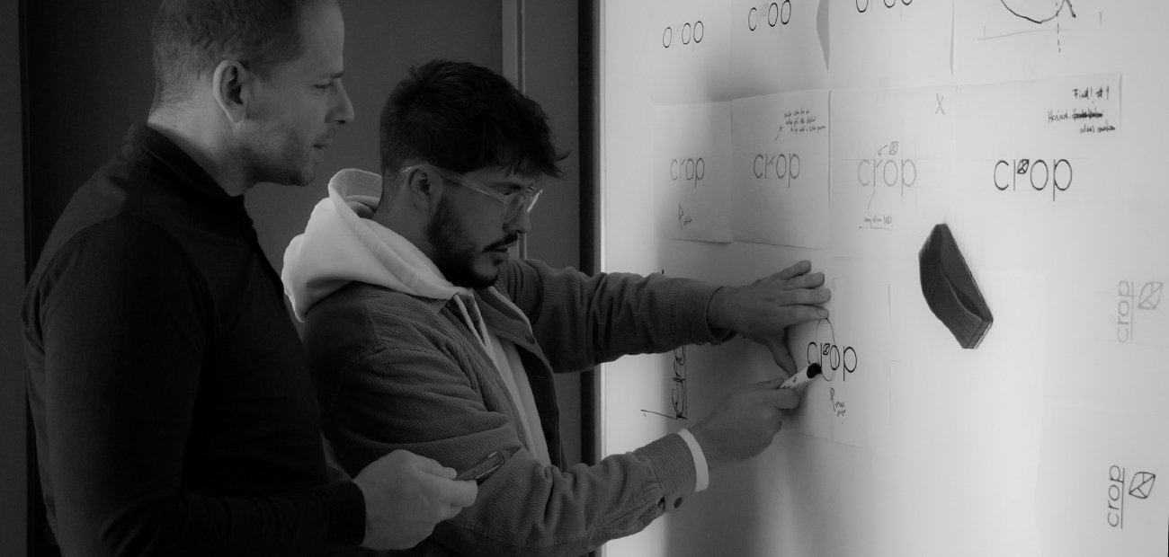
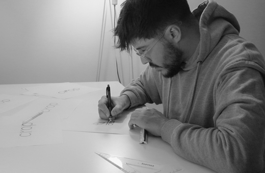
Now back to the brand identity of the CROP project. After conducting, thorough research of the market and activities, I, with the support from my agency colleagues, shifted my focus from research to the sales advantages, benefits and values that the brand brings to the market. As it was a completely new project, we started from the keywords we associate with CROP and thought about what we could do with them. The keywords we named were tomato, healthy, nutritious, bio, modern technology, vertical cultivation and the Netherlands. We found the greatest source of inspiration and space for visual play in the primary activity of the brand, but also in the synergy that is created by combining all the keywords into one complete story. At the agency, we approach every project and challenge with a desire to create a strong personal brand story that offers our clients added value and elevates their idea to heavenly heights.
The idea for the logo came from the company's primary activity, which is precisely the crop, as the name suggests. The accent in the logo is placed on the letter R in which the stylization shows the plant, shoot, growth, beginning. The graphic form is derived from the vertical line and the sheet on the right. The stylization itself retains the shape of the letter "R" and the name CROP can be read without interruption. This also gave us an illustrative monogram of the letter "R" which can be used as a separate icon of visual identity for application to certain items via stickers and the like.
The tomato symbol is associated with the typography used in the creation of the logo where the geometric strokes specifically in the letters c, o, and p show the shapes of tomatoes that are regular and uniform in size. We represent modern technology and vertical cultivation through a leaflet that in a vertical relationship builds on the typographic part of the sign and shows vertical cultivation, growth and development.
The Netherlands is depicted through color, and color is one of the basic elements of visual identity (along with the sign, logo, and typography). The primary color of the visual identity is orange, which symbolizes the colors of the Netherlands as the home country of one of the founders of the company, creating a link with the country from which the “know-how” and complete infrastructure/technology come from.
To learn even more about the final results of our process take a look at the case study here.
The answer to the challenges of the future
I would like to conclude by pointing out how I believe we have strengthened the brand and made it competitive by giving it a playful, simple and appealing visual identity. We have opened numerous opportunities for its further elaboration and development and made the brand accessible and acceptable to the end consumer. At the same time, we have strengthened Croatia's position on the domestic and foreign markets by positioning CROP as an organic product of the highest quality. As a designer and one of the Younited creatives, I am proud to have participated in such an innovative project that pushes boundaries and creates the foundations for a better future for all of us.