Achieving the feeling of a harmonious home on your own is not an easy job. It is a job you should get Alfa stan Grupa from Zagreb to do for you. Trust us. They have the reliability, dedication, and expertise needed to give your new apartment the much-needed feeling of a home. Constantly looking for creative and innovative solutions, they push the boundaries of housing by making the quality of life and safety their number one priority.
THE ALFA OF THE "ALFA AND OMEGA" IN CONSTRUCTION
The company's vision is to permanently stand out in the market with a combination of modern technological solutions and notable architectural projects. Guided by such thinking, they decided to refresh their visual identity in 2018. As rebranding was a great way for Alfa stan Grupa to expand and seize the opportunity to position itself as a market leader, the new brand identity needed to be memorable, readable, interesting, and relevant in all its applications and forms.
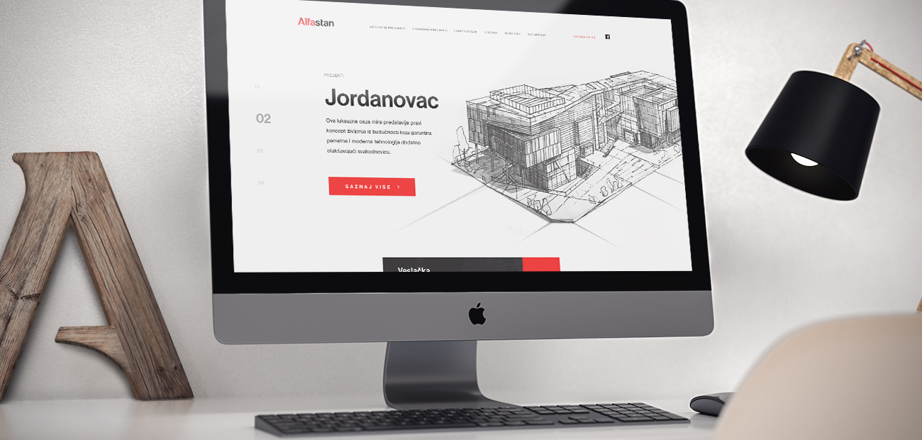
THAT HUMAN TOUCH
A brand identity is how the audience sees and perceives your brand. In a sense, the first impression of a brand sets the tone of its personality that reflects in the way a business is positioned and how it communicates with its audience. Admittedly, all the future interactions with the brand will depend on this impression and „personality“ assessment made at this point. This is why humanizing the brand is of key importance for building long-termed relationships based on trust and accountability.
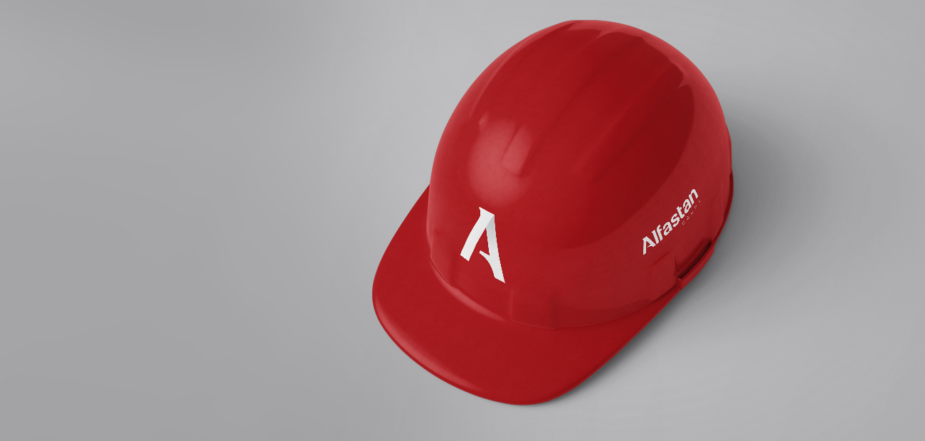
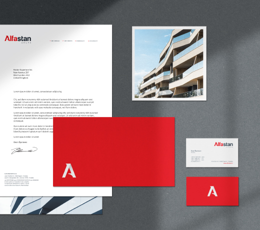
With this in mind, we decided to create a new visual identity that gives a a better understanding of the client's brand purpose. After careful planning and audience research the new visual identity now rightly outlines all the company's values to employees, customers, partners and the general public. All buildings in the initial phase are created as hand-drawn sketches on paper. This is where the key human touch combined with creativity, reflection, architectural and artistic value becomes unattainable by any technology or program.
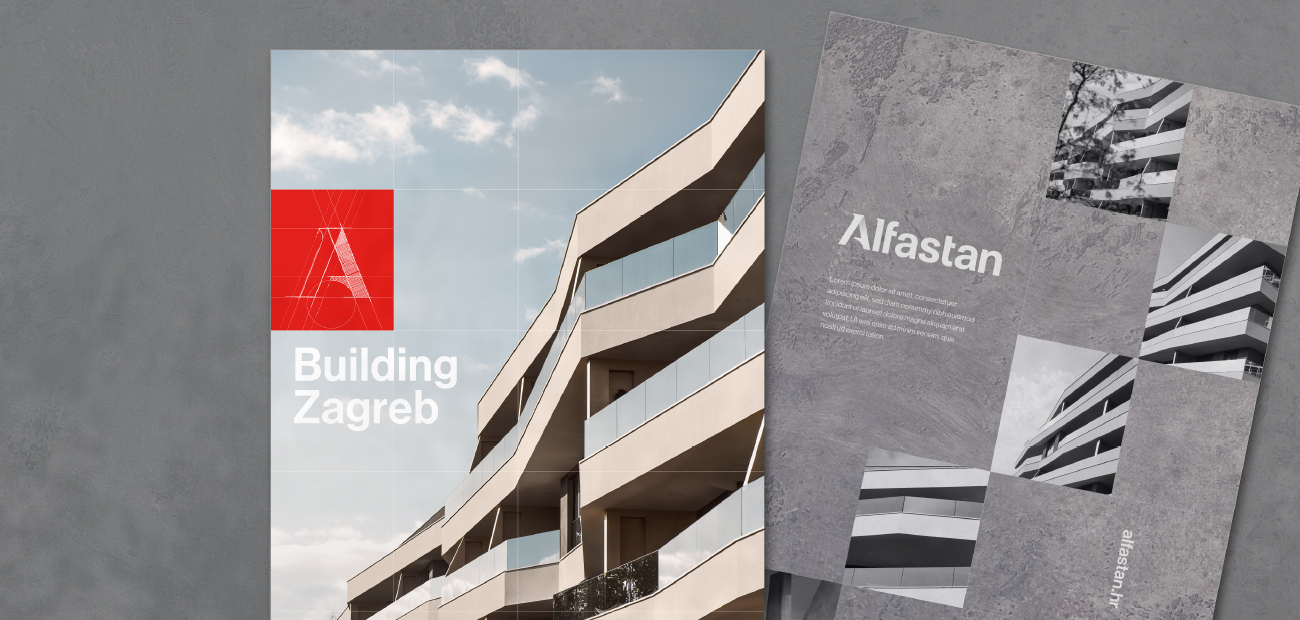
Uncompromising approach, careful planning and authenticity were the main postulates that served us as inspiration. A sketch of the stylized letter „A“ was the basic building block for the rebranding process. When designing the logo, a clean and strong form was achieved as a the visual counterpart to what Alfa stan Grupa represents. By choosing red and gray-blue colors with unique typography, a rounded visual was created as well as the brandmark that is a stylized variant of the letter „A“ from the logo. All branded material applies to diverse digital channels but also in an offline environment representing the brand identity in an original yet relevant way.
Do you need us to help you make your brand stand out, became recognizable and unique in its identity?
Reach out to us!
Recent projects
VIEW ALL PROJECTS
Dom Ekspert
Rebranding of the real estate agency

Croatia Charter
The professional charter company offering luxury yachting experience

CROP
Visual identity, branding

WRC Croatia Rally 2021
World's top sporting event / 22.-25.4.2021.

Grand Sea Villas
A luxury sea villa development in Istria

DRACO PRO
Waterproofed A to Z marketing strategy

Welcome to Novi Zagreb
Avenue Mall spring campaign

Meandar
Residential project in Novi Zagreb

Tedson motors
Visual identity, brand book, web design and development, social media

LJ Sports Group
Naming, branding, go to market strategy, LinkedIn strategy
If you like what you see...
Let’s younite