Visual identity is more than just a business logo; it is a connection that grows over time and with each interaction a person has with a business.
Brand identity is often described as the personality of a business, while visual identity is its visible expression.
Our esteemed partners from Dom Ekspert, a real estate agency, decided to revamp their visual expression. They sought a new visual identity and a modernized website.
Both their current visual identity and website felt outdated and failed to reflect their expertise and core values.
Their brief was straightforward: they desired a modern and elegant presence that accurately represented their business. They firmly believed in a holistic and unwavering approach, valuing long-term relationships as the cornerstone of their operations. These core values were to be prominently showcased in their new identity.
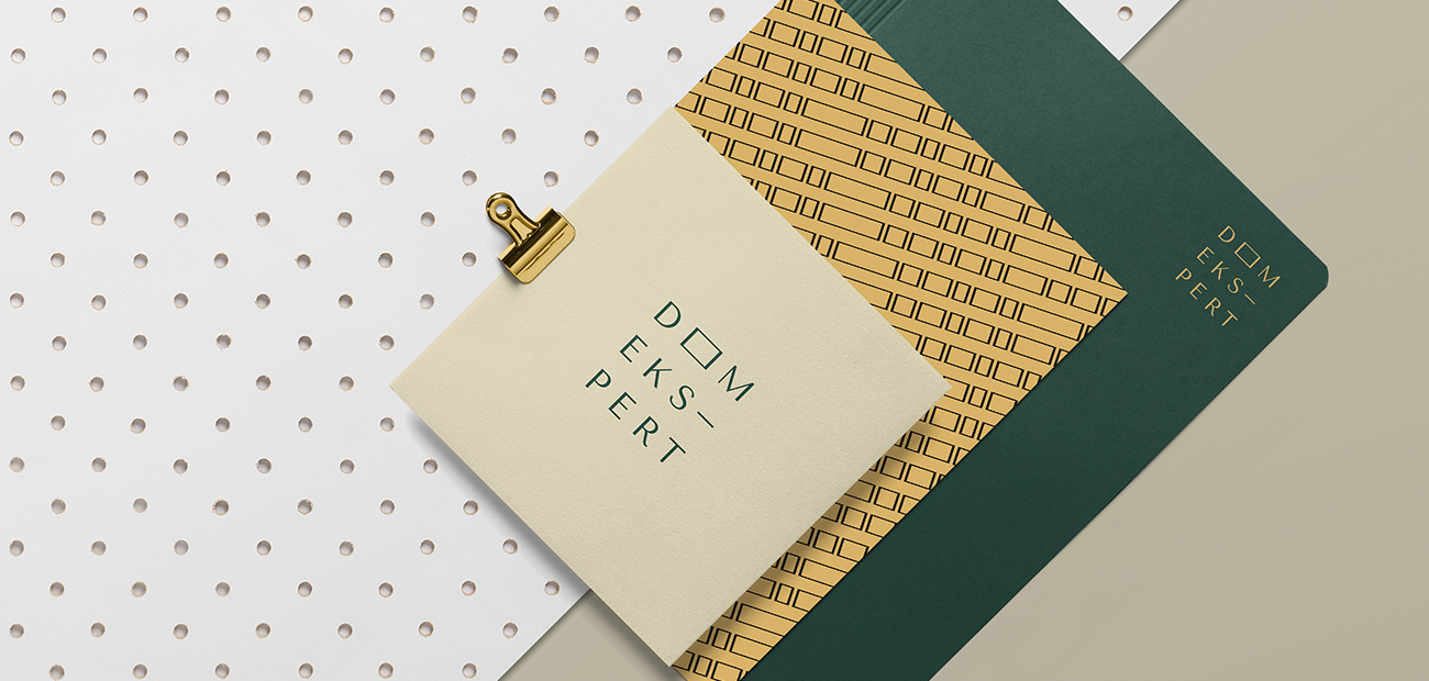
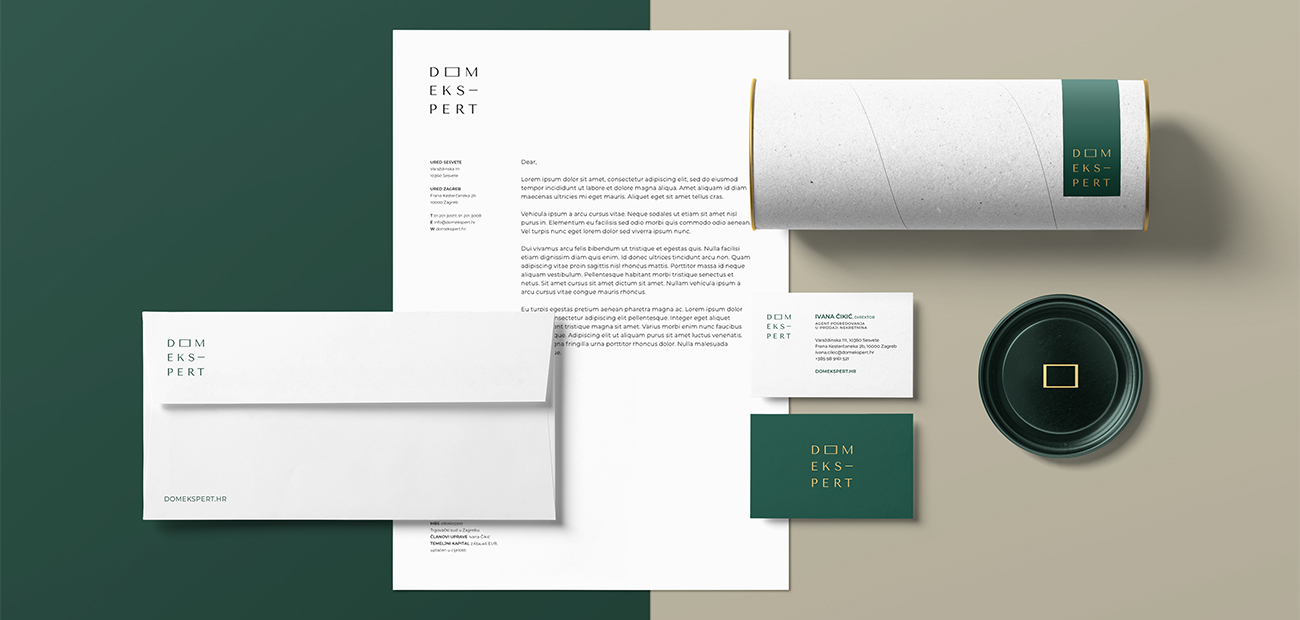
The only technical requirement provided was the inclusion of the Royal Green color as part of their new identity.
HOW DID WE BEGIN THE PROCESS?
The initial stages of creating a visual identity involve researching, seeking inspiration, and piecing together elements to form a clear vision. In this case, we had a solid starting point: a clear understanding of the values and messages that needed to be conveyed.
Additionally, we were aware of the client's preference for the Royal Green color.
While clients sometimes make creative processes more challenging by insisting on specific design elements, in this instance, it was helpful. The selection of the English Royal Green color served as the foundation for the entire visual identity.
This choice guided us in selecting the appropriate direction for other brand elements, including the logo, secondary color, fonts, and more.
We opted for a secondary color of golden, which complemented Royal Green while also adding a touch of luxury.
Usually, throughout the process there are numerous drafts and sketches, and this time was no exception.
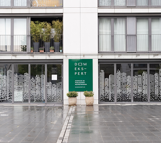
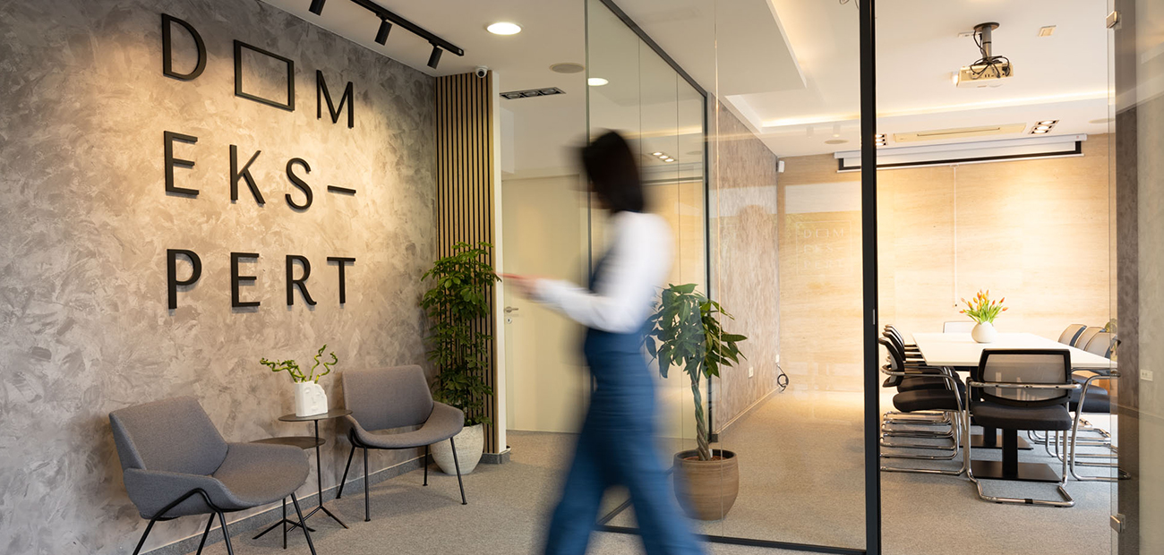
Ultimately, we settled on a typographic logo divided visually into three levels.
These levels symbolize floors, a common building element. Each letter represents a separate entity, mirroring the individuality of each housing unit.
The name "Dom Ekspert" is divided into three levels by syllables, reflecting its natural pronunciation.
Two more details were inspired by this backstory - the letter "O" in "DOM" is shaped as a square rather than a circle. Additionally, a hyphen divides the word "EKSPERT" as "EKS-PERT." This hyphen visually represents a balcony or terrace, commonly seen as a visual link to the outside on residential buildings.
TYPOGRAPHY WITH STRONG CHARACTER
The chosen typography is the Google font called Tenor. This font is a typical sans-serif typeface with distinct character, particularly noticeable in the letter endings of r, k, and m. It strikes the right balance between luxury and boldness.
"The value of an idea lies in the using of it."
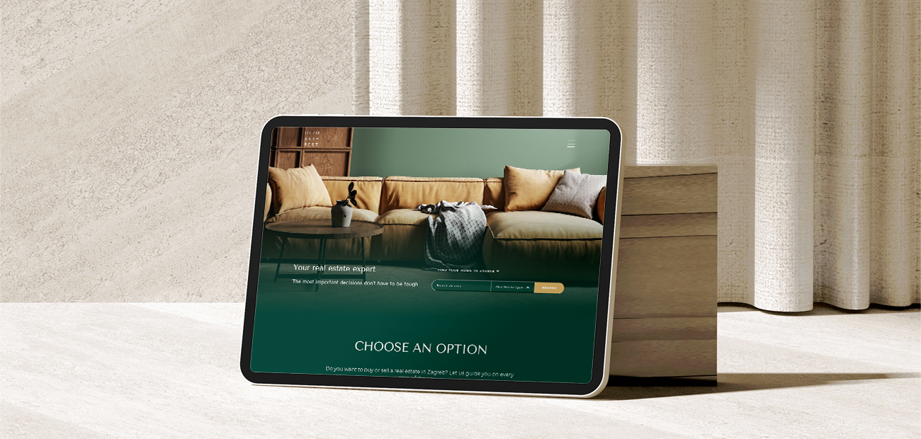
This famous quote by American inventor Thomas Edison serves as inspiration, highlighting that the value of a visual identity lies in its utilization. One of the most significant applications of the new identity is the revamped Dom Ekspert website. It is modern, beautifully designed, relevant, and intuitive.
MODERN AND SUBLIME COMBINED
The new visual identity and website leave a modern, clean, and elegant impression. We aimed to achieve a modern yet timeless solution. Modernity reflects the current era of the identity's creation, while timelessness ensures a lasting impact.
With the rebranded Dom Ekspert now poised to conquer the market and continue to impress both employees and clients, we take pride in our collaborative development process.
If you like what you see, reach out to us!
Recent projects
VIEW ALL PROJECTS
Croatia Charter
The professional charter company offering luxury yachting experience

Alfa stan Grupa
Visual identity, branding

CROP
Visual identity, branding

WRC Croatia Rally 2021
World's top sporting event / 22.-25.4.2021.

Grand Sea Villas
A luxury sea villa development in Istria

DRACO PRO
Waterproofed A to Z marketing strategy

Welcome to Novi Zagreb
Avenue Mall spring campaign

Meandar
Residential project in Novi Zagreb

Tedson motors
Visual identity, brand book, web design and development, social media

LJ Sports Group
Naming, branding, go to market strategy, LinkedIn strategy
If you like what you see...
Let’s younite